Yorkshire based heritage manufacturer Hopkins rebrands and invests in its future while honouring its roots
The Hopkins rebrand story 1957 to 2025
Rebranding a heritage business isn’t about forgetting the past, it’s about carrying its legacy forward with clarity, purpose and modern relevance.
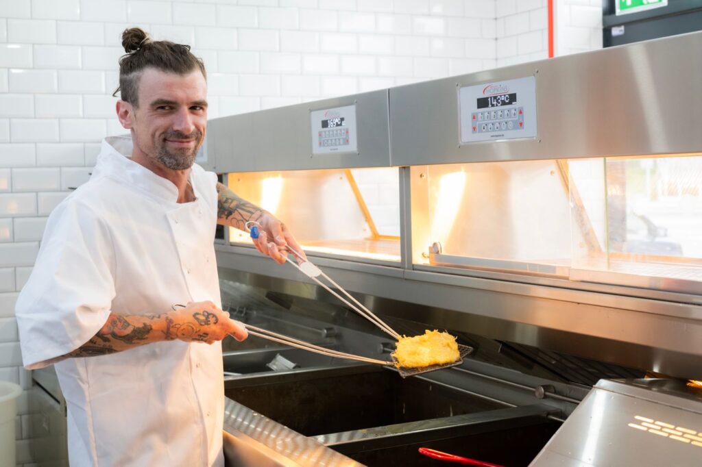
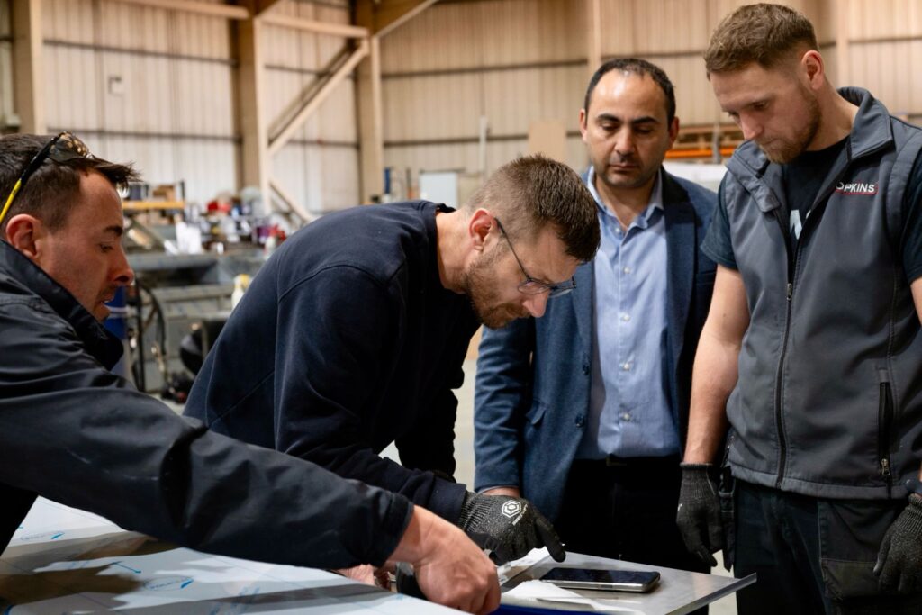
Hopkins has been designing and manufacturing bespoke frying ranges for fish and chip shops since 1957, the opportunity to rebrand is not just timely, it’s transformative.
In today’s marketplace, even the most established businesses must adapt as markets evolve, customer expectations shift and new generations of employees and buyers look for more than just price or quality, they seek meaning, values and identity. They want to align themselves with the businesses they buy from, that’s where rebranding plays a pivotal role.

Start with Why: purpose drives perception
Author and TED speaker Simon Sinek’s famous mantra, “Start with Why,” is more relevant than ever. The ‘why’ of this rebrand lies in reaffirming the company’s deep-rooted purpose: to champion the craft of British fish and chip culture through tradition, precision engineering, integrity, relationships and innovation.
A rebrand should not just update visuals, it must reflect ‘what the company values,’ ‘what it believes in,’ and ‘what impact it strives to make.’

Whether it’s sustainability in materials and energy efficiency, innovative products or empowering skilled friers and business owners, the rebrand must speak to those ideals with clarity and pride.
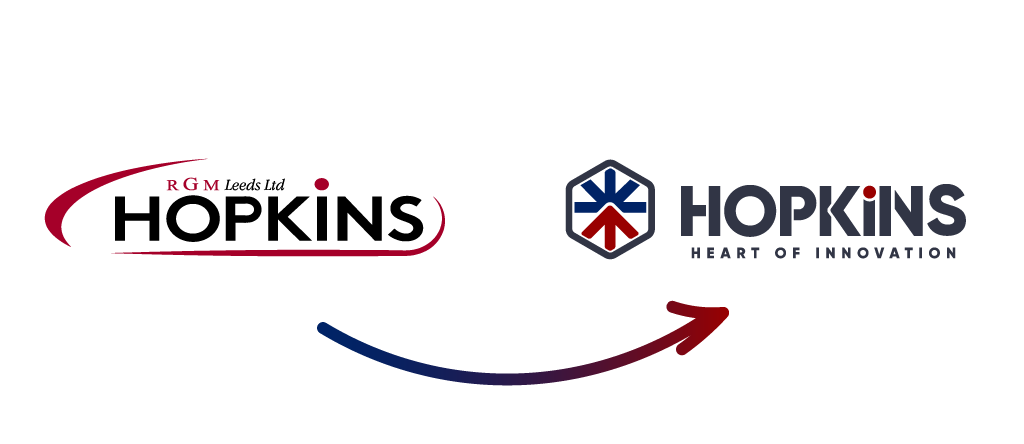
The impact of visual identity: logo, colours and style
A new logo is not just a graphic, it’s a symbol of intent. It communicates change, direction, and attention to detail. Paired with contemporary colour palettes, typographic consistency and updated design language, the brand begins to visually reflect what the company stands for today, now and for the future.
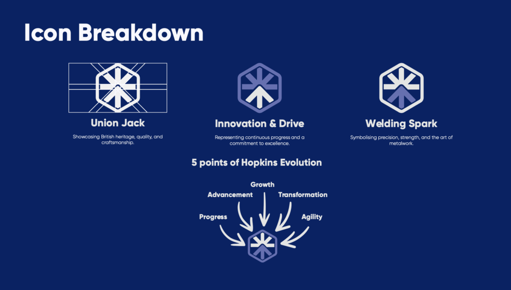
For example, a refined typeface inspired by industrial design, with colours reflecting trust (navy), passion (red) and innovation (charcoal), and heritage can visually express the balance between tradition, innovation and modern.
This affects not only external perception, building brand loyalty and becomes a rallying point for the whole organisation.
Culture and continuity
Rebranding isn’t abandoning your legacy; it’s investing in its continuity. When done with care and context, it strengthens the bridge between past and future.
For a business born in 1957, with decades of expertise in frying range design, craftsmanship and manufacture, the goal is to signal: ‘We’re proud of where we’ve come from and we’re ready for what’s next.’
Hopkins
T: 0113 257 7934
F: www.facebook.com/HopkinsRGM